Union Investment — customer service application overview

Union Investment

The application is used by the customer service to manage and process customer requests. It includes a wide range of tasks such as opening stock portfolios, changing customer information, sending documents, and giving help regarding general questions.

The Status Quo

IMG_02 — Union Investment existing application

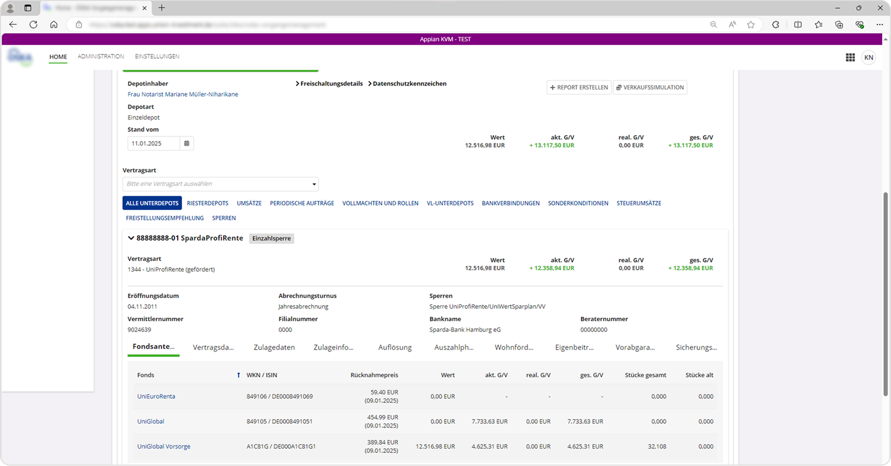
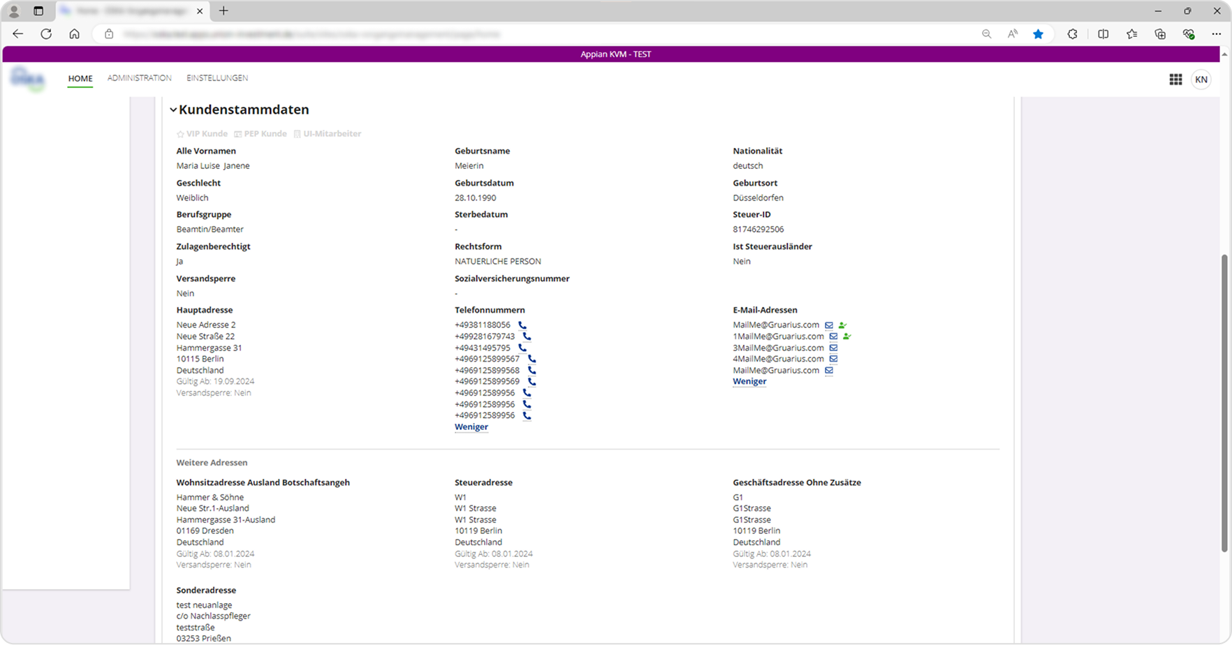
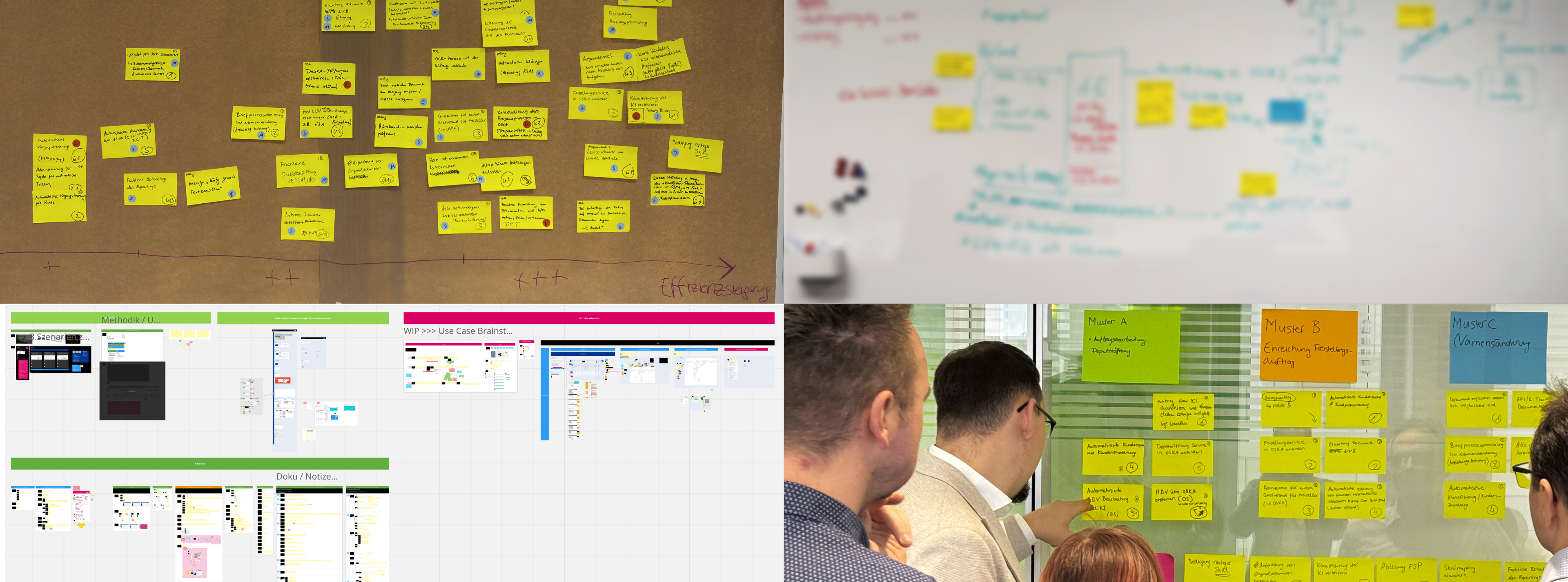
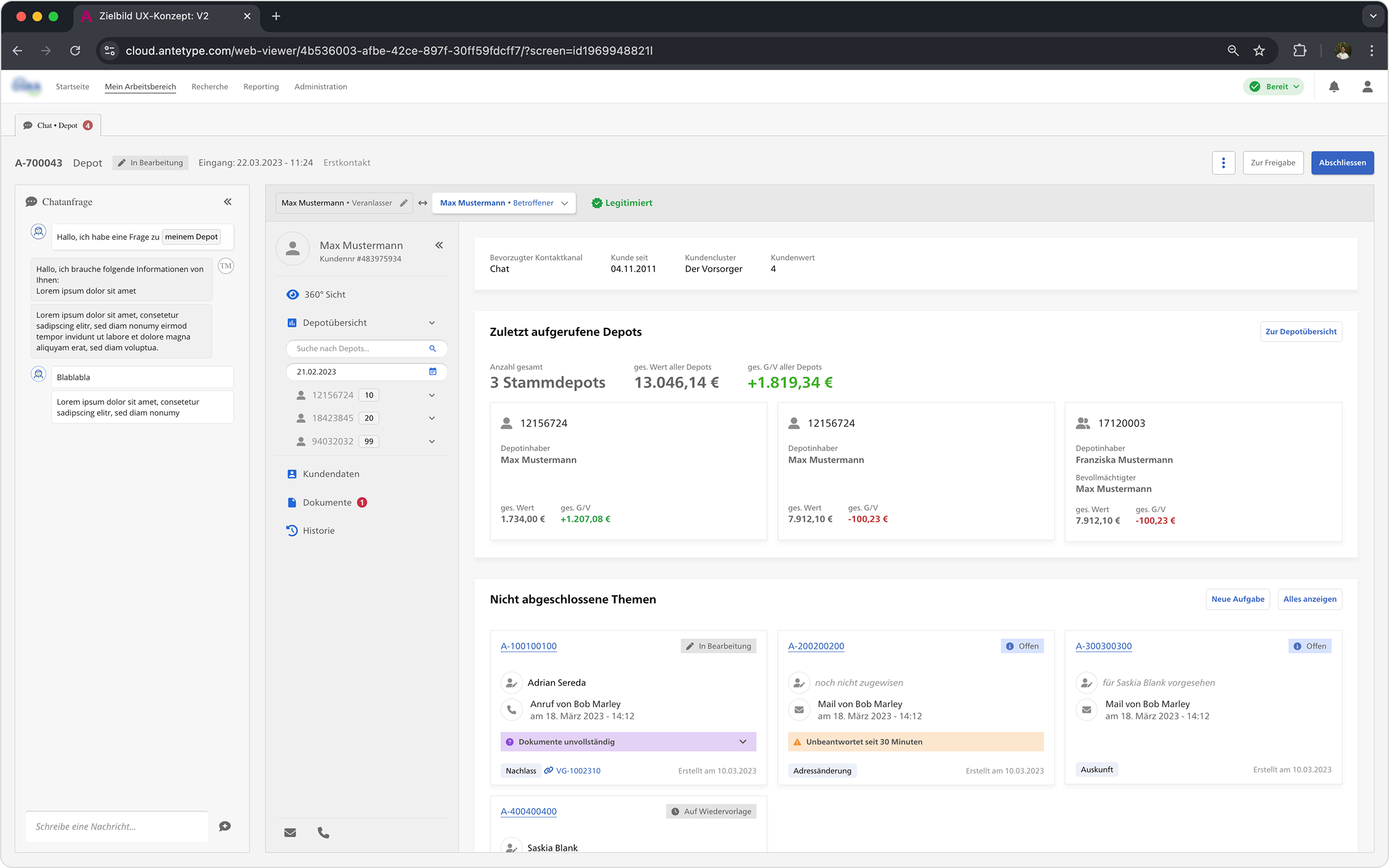
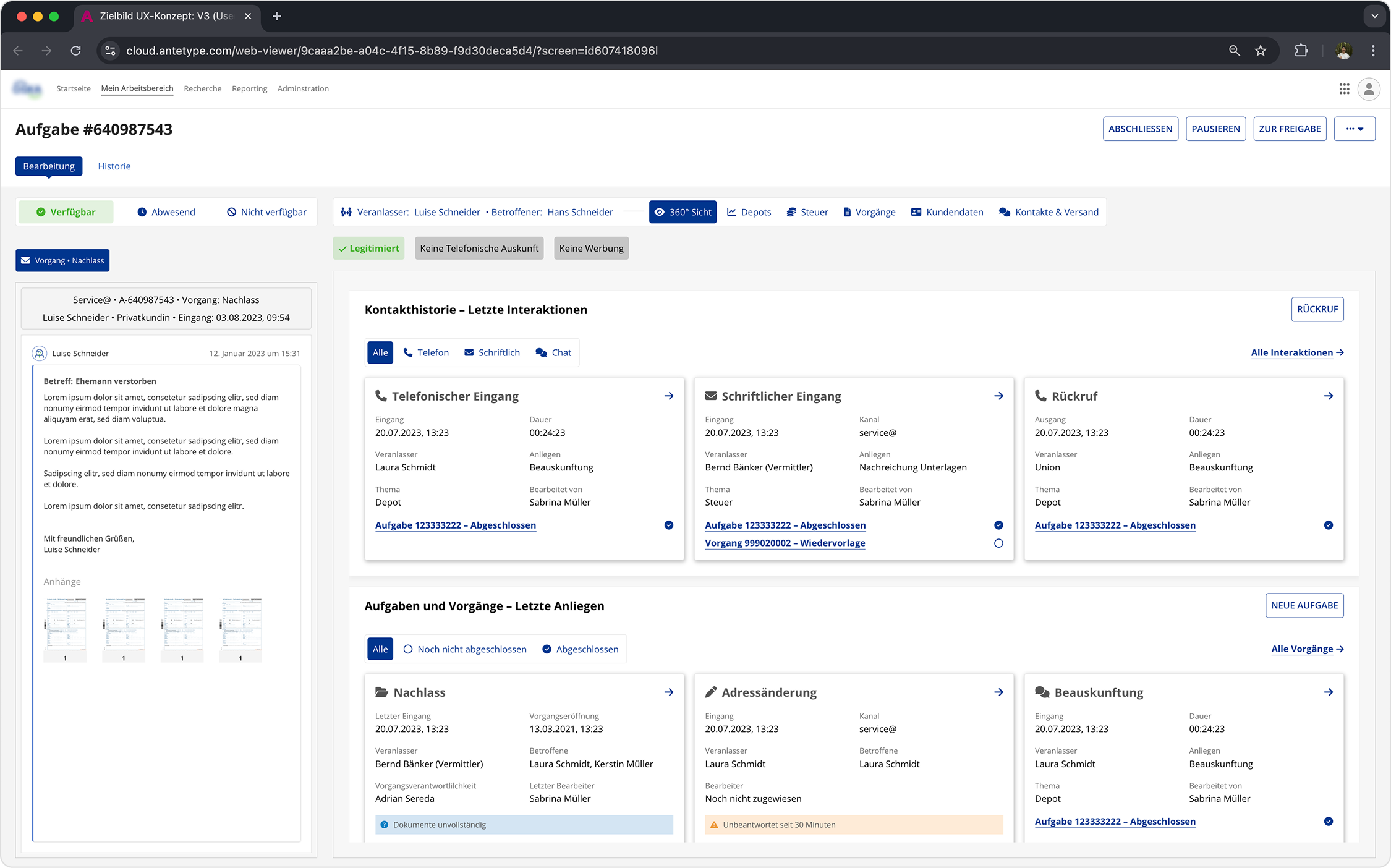
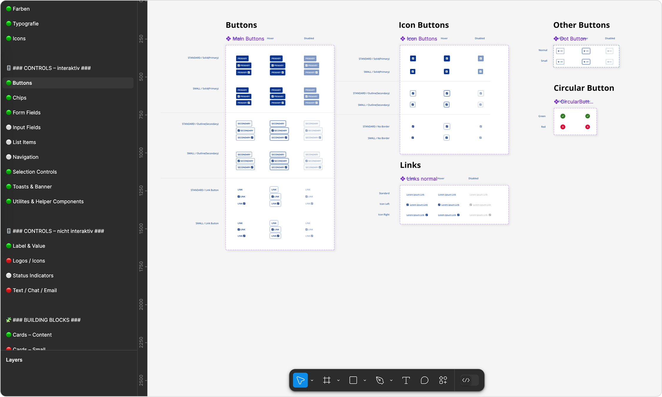
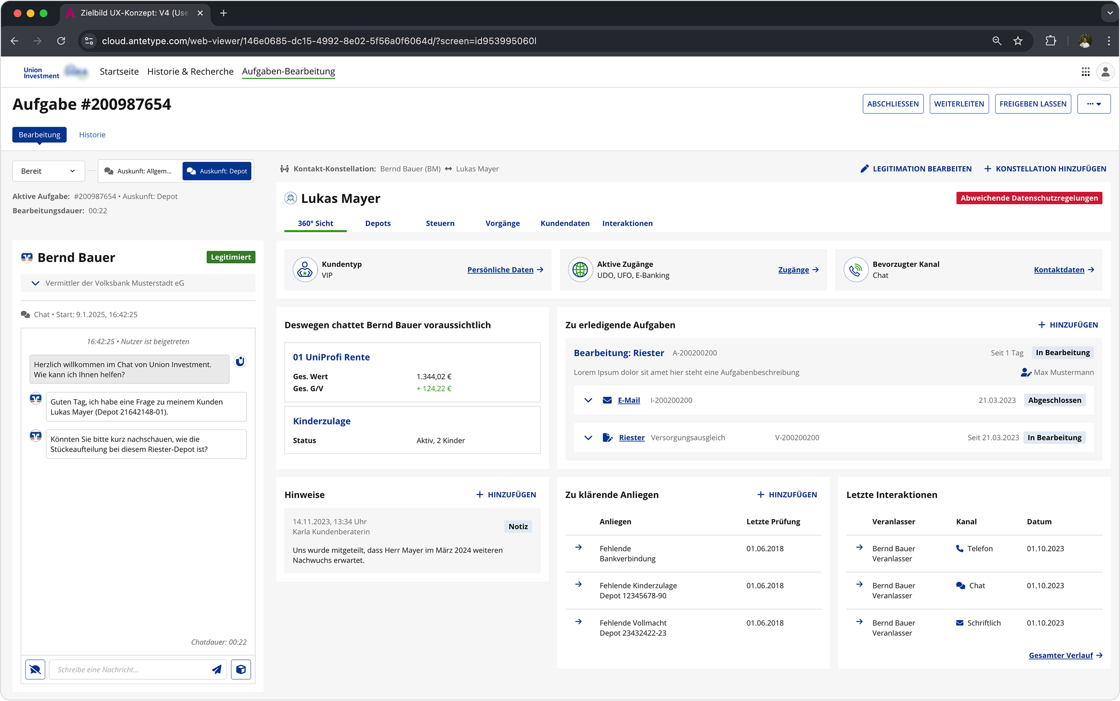
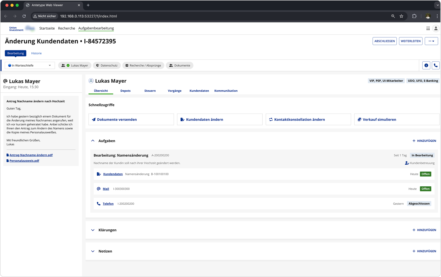
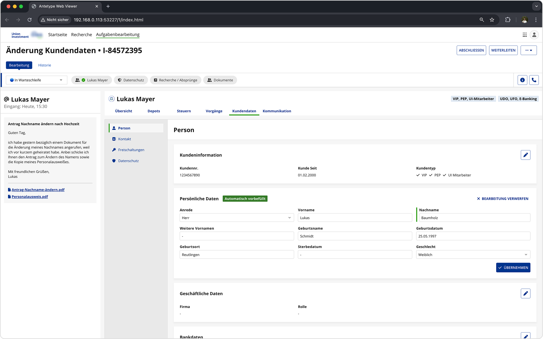
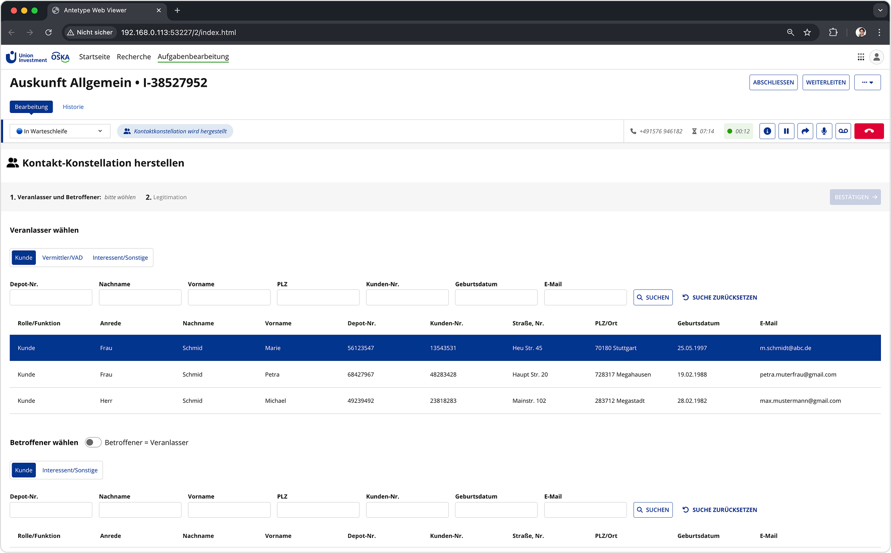
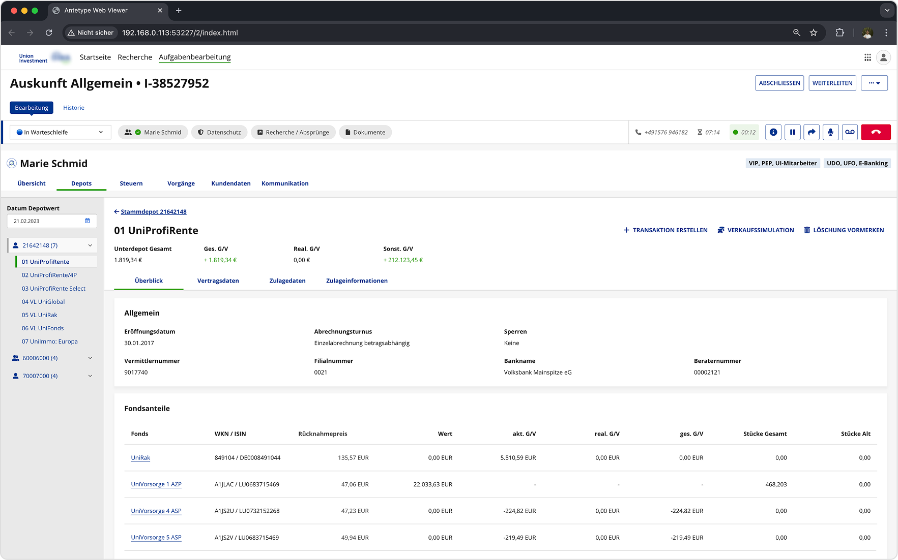
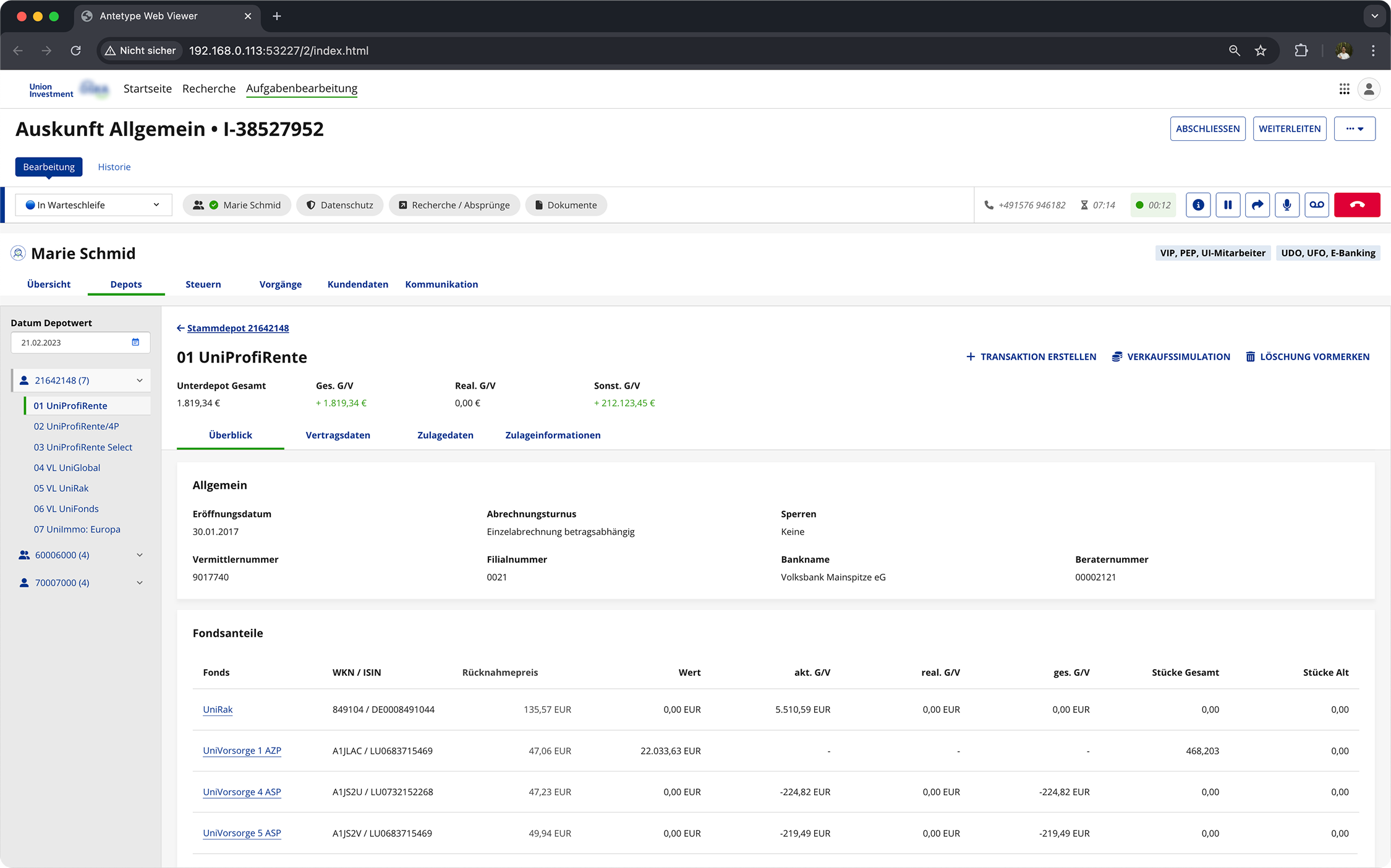
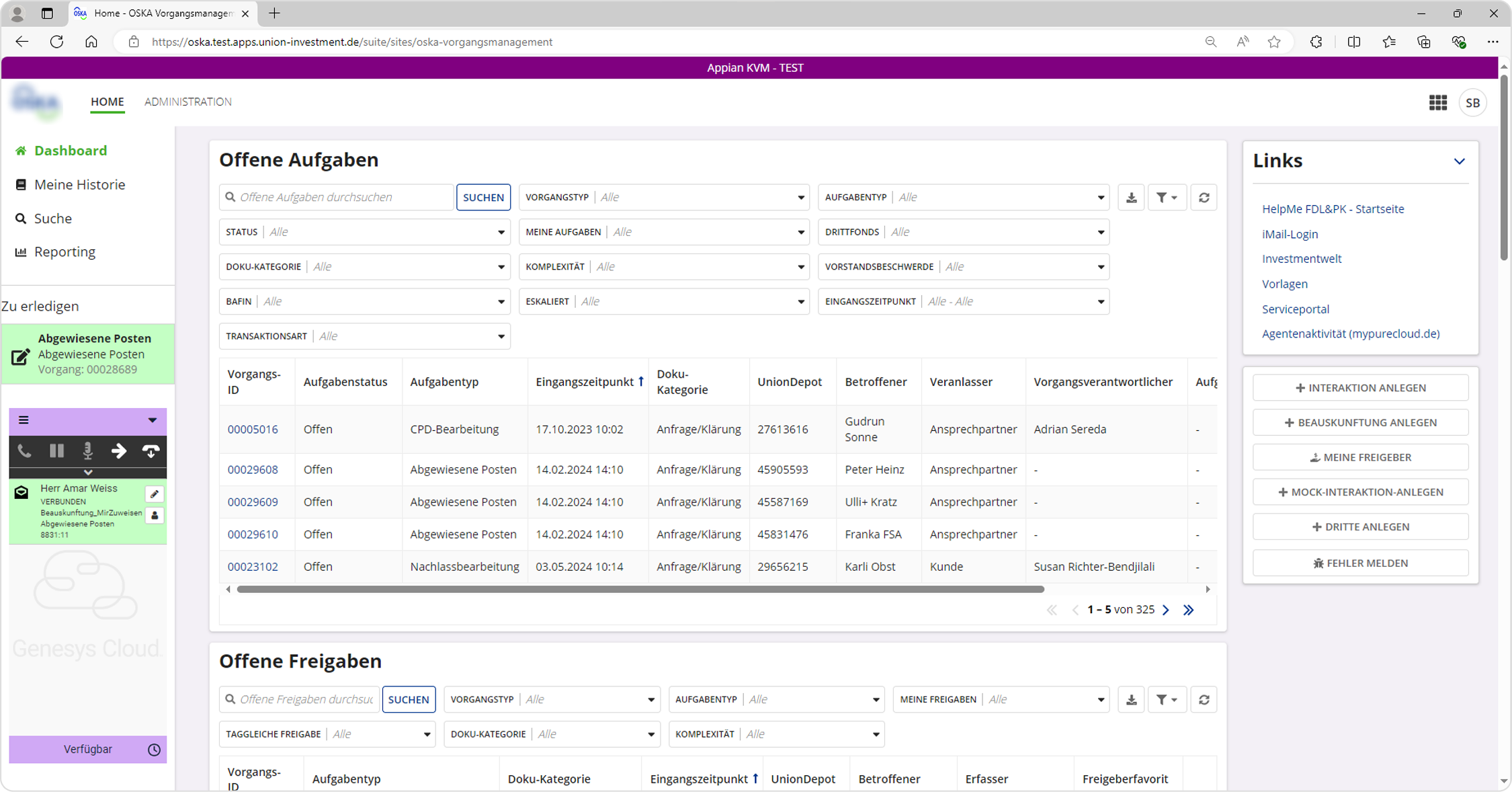
This version of the application is an overhaul of their old legacy system. However, during the creation of it user experience and modern web frameworks were not taken into consideration. A low-code platform was used for the implementation, and because of that, many restrictions in regards to layout and UI components are present.

My role was to support the current implementation by identifying missing features necessary for daily business and conceptualizing them while also overhauling the application to meet modern business requirements and enabling omnichannel management. The concept should be based upon the existing framework and low-code platform.


IMG_03 — Existing application detail
IMG_04 — Existing application detail
IMG_05 — Existing application detail
IMG_06 — Existing application detail

Our Approach

Because of the nature of the application, countless use cases and a combination of them were possible. This is why we first had to conduct interviews and discussed a lot of the use cases in workshops.

IMG_07 — Workshop or research session

Insights

The interviews and discussions with the stakeholders helped us to better understand what the users actually do, how complex their workflow is, and the problems they face on a daily basis. While many findings were gathered, the following were particularly impactful.

Performance too slow

The current application was built with a low-code platform. In order to accommodate for complex patterns needed for daily work, a lot of components were tweaked and used for unintended purposes. This led to increased render times and overall slower loading times when navigating through screens.

Confusing Structure

Related content and functions were torn apart and displayed in different sections. This led to long paths between clicks and a difficulty in scanning important information, which resulted in slower workflows. It was especially frustrating for users because they were used to using keyboard shortcuts when navigating through the legacy application.

No Overview

Different tasks for the same customer were not grouped together and mapped to the customer. This led to delays in working through customer requests since there was no overview for tasks that are currently in progress, already done, or open.

First Iteration Concept

IMG_08 — First iteration concept wireframe

The goal of this initial concept was to ideate on how the general structure and workflow could be improved. We wanted to provide a more customer-centered workflow by navigating through user profiles instead of strictly working through unrelated tasks that later on get mapped to a user.

However, technical limitations were not considered for this concept. The feedback for this concept and the general idea of navigating through customer-profiles was positive.

Second Iteration Concept

IMG_09 — Second iteration prototype screenshot

The focus for this iteration was to take into account the existing frameworks and all the technical limitations in regards to the general layout and structure of the application. While we used many of the components of the low-code platform, we haven't strictly adhered to them and added some of our own. This version also included realistic content that users work with on a daily basis.

Usability tests were conducted starting with this iteration. 6 users were given 10 tasks to accomplish. At the end of each usability test, interviews were held, and a UMUX-Lite questionnaire was filled out to quantify the user's experience with the prototype.

The questionnaire was filled out in regards to the current application as well as the tested prototype. After the testings were done, findings were clustered in Miro and organised and summarised into specific categories.

Usability Test Results 2nd Iteration

Due to the high correlation of the UMUX-Lite with the System Usability Scale (SUS), we can calculate a potential SUS score using an equation.* Based on the predicted SUS score of 68.04, the subjective usability perception of participants can be described as average, roughly corresponding to the SUS benchmark.

Current Application SUS 52,15
Prototype — 2nd Iteration SUS 68,04

* Lewis, J. R., Utesch, B. S., & Maher, D. E. (2013, April). UMUX-LITE: when there's no time for the SUS. In Proceedings of the SIGCHI Conference on Human Factors in Computing Systems (pp. 2099–2102).

Component Library

IMG_10 — Figma component library screenshot

For the third iteration we wanted to conform to all the components from the low-code platform in order to set realistic expectations for the users. This meant using only components that were available through the low-code platform as well as using identical styling for them.

To achieve this, we analysed their web documentation and translated it into a Figma component library.

Third Iteration Concept

IMG_11 — Third iteration prototype screenshot

The feedback gathered throughout previous usability testings was taken into account and we created a more detailed concept with more information and a more realistic use case.

Another round of usability tests was done with the same setup as before. This time 7 participants took part.

Usability Test Results 3rd Iteration

Based on the predicted SUS score of 71.65, the subjective usability perception of participants can be described as above average, beating the SUS benchmark. This result shows that after three iterations, the perceived user experience of the application was greatly improved, achieving our goals set at the beginning.

Current Application SUS 49,98
Prototype — 3rd Iteration SUS 71,65

* Lewis, J. R., Utesch, B. S., & Maher, D. E. (2013, April). UMUX-LITE: when there's no time for the SUS. In Proceedings of the SIGCHI Conference on Human Factors in Computing Systems (pp. 2099–2102).

Fourth Iteration, Outlook, Learnings

IMG_12 — Fourth iteration or final deliverable

A learning we've made was that during usability tests everything seemed to go smoothly. However, after the first implementations were made, we quickly realized that the performance on live servers and on production was drastically different from the prototype. Certain workflows and patterns couldn't be properly reproduced on production because the slow loading and render times made it impossible to work with.

In retrospect we should have tried to get a MVP on production faster so we could better observe how certain workflows work under realistic conditions.

The ongoing goal therefore will be to think about ways on how to adjust and adapt different processes not only in their UI and layout, but in their fundamental structure in order to achieve a similar performance compared to the fast keyboard shortcut workflow from the legacy application.

As the concept does not represent the full functional and content-related scope, more deep-dive workshops are required for conceptualising certain aspects before they are made available for further implementation.


IMG_13 — Process artefact or iteration detail
IMG_14 — Process artefact or iteration detail
IMG_15 — Learning artefact or final screen
IMG_16 — Learning artefact or final screen